Turning messy CSVs into a guided intelligent flow.
Designing a clear path through messy CSV data for district admins and staff
* Work shown with enterprise-identifying details redacted. Full prototype available on request.
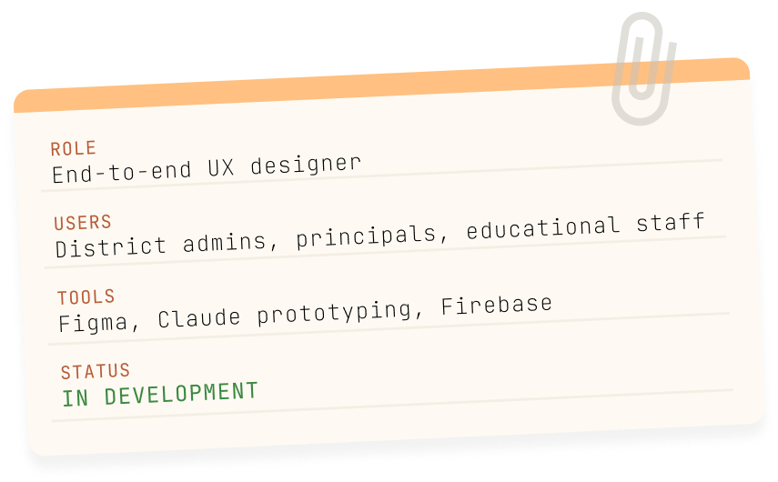
ROLE
End-to-end UX designer
USERS
District admins, principals, edudcational staff
TOOLS
Figma, Claude prototyping, Firebase
STATUS
IN DEVELOPMENT
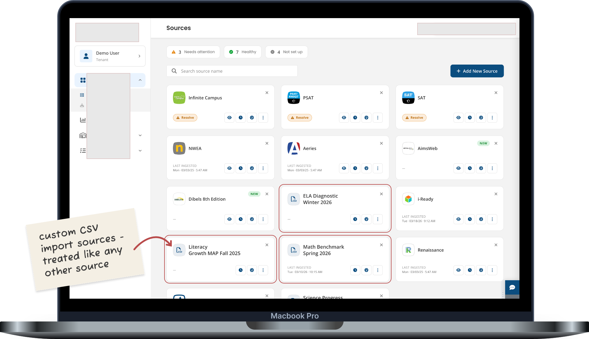
💻 SOURCES DASHBOARD: THE BIGGER PICTURE
→ The Sources Dashboard. Custom CSV imports sit alongside preconfigured vendor integrations.
📑 THE PROBLEM
Every vendor exports data differently.
School districts pull in assessment data from a dozen different vendors, and none of them speak the same language. Different column names, different structures, different conventions.
Before any of it can be used, it all has to be translated into something consistent. That translation step is where things get messy. Data engineers know it well, since they live in spreadsheets and mappings all day.
Other people, like building admins who just need to upload a file and move on, mostly never see it, even though it's tedious and easy to get wrong.
Early on, I leaned on research that already existed. I sat in on product and engineering conversations and picked up a lot of user insight that way, learning what frustrated people about the current process.
I didn't start this project from scratch. It picked up from work that was already underway, and a lot of this story is about working within constraints that were already there.
Get it wrong and the data that teachers and administrators rely on for instructional decisions is wrong too.
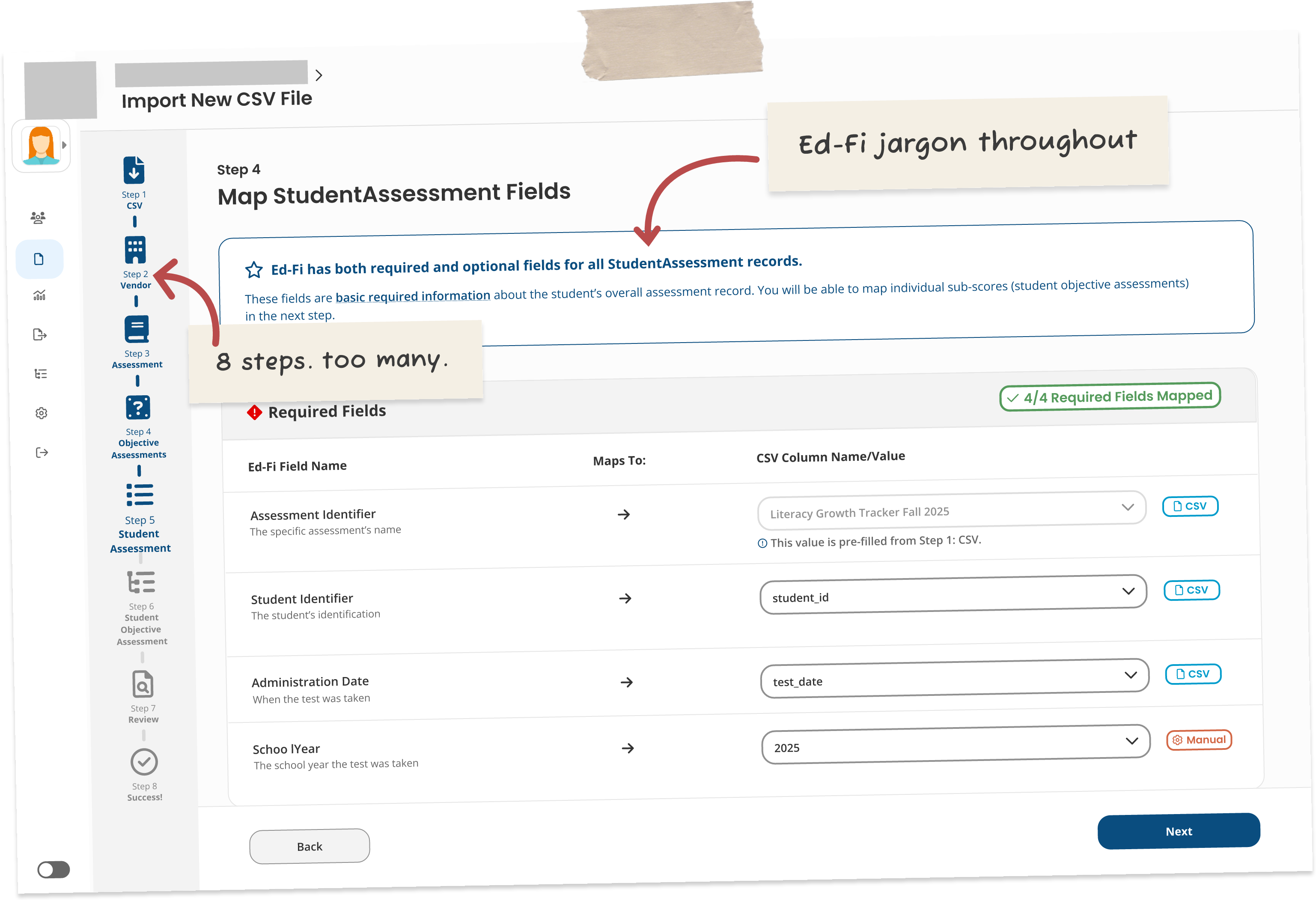
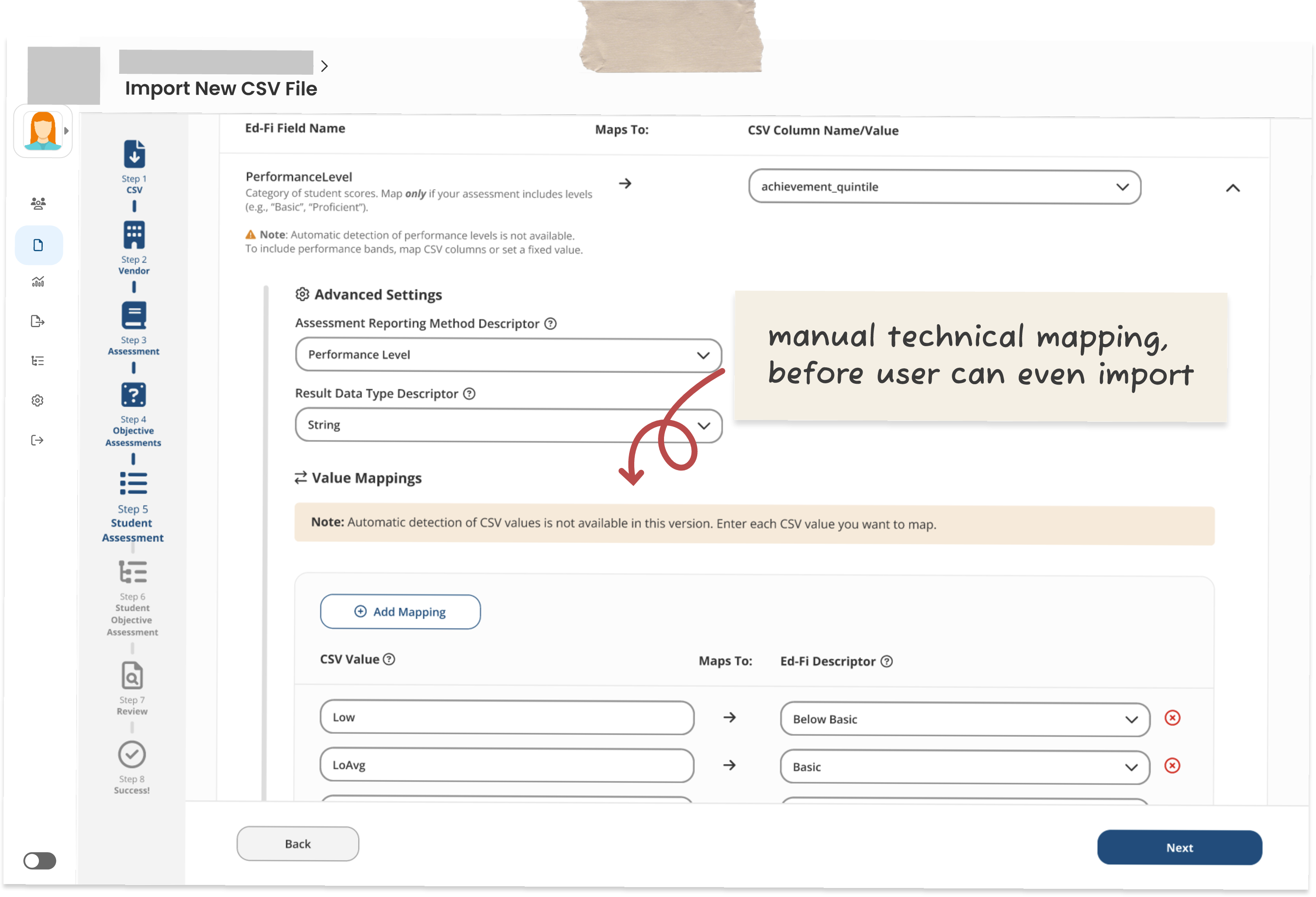
WHERE WE STARTED - THE ORIGINAL DESIGN
↩️ THE PIVOT
Making sense of messy data.
The original Figma prototype was built around the technical requirements of the Ed-Fi data standard.
Fields were labeled with the technical Ed-Fi names, and users had to manually map raw CSV values to Ed-Fi performance level descriptors. An 8-step sidebar walked people through it.
It exposed every technical decision to every user, no matter how comfortable they actually were with that. It wasn't wrong, exactly, just built around the data model instead of the person using it.
→ The original Figma design: 8-step stepper, Ed-Fi terminology throughout, manual value mapping to technical descriptors.
Functional but built around the data model not the user.
• Complexity progressive and optional; users can return to the platform to enrich their data
The real shift wasn't about taking anything away from technical users. It was about not making everyone deal with that complexity before they actually needed it.
So the focus moved from how the system stores data to how people actually think about their own data.
💫 THE WIZARD WORKFLOW
How it works. (Five stages)
01/
Upload
CSV files are dense and hard to scan. After upload, we auto-group all columns into related categories and surface issues immediately so users can start mapping with clarity.
02/
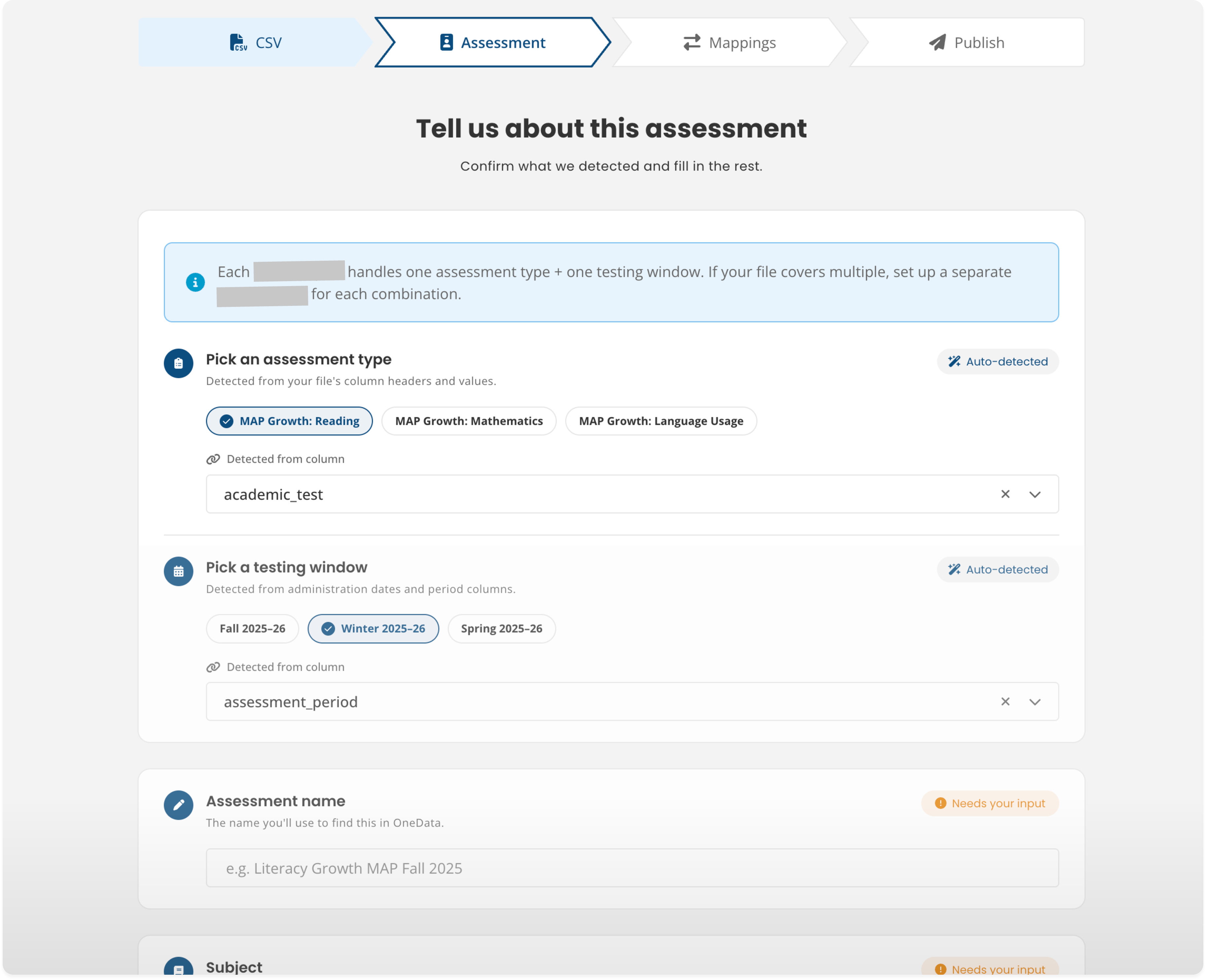
Assessment Information
Auto-detected values shown clearly as suggestions, labeled with their source column. "Needs your input" badges distinguish what the system knows from what it needs from the user.
03/
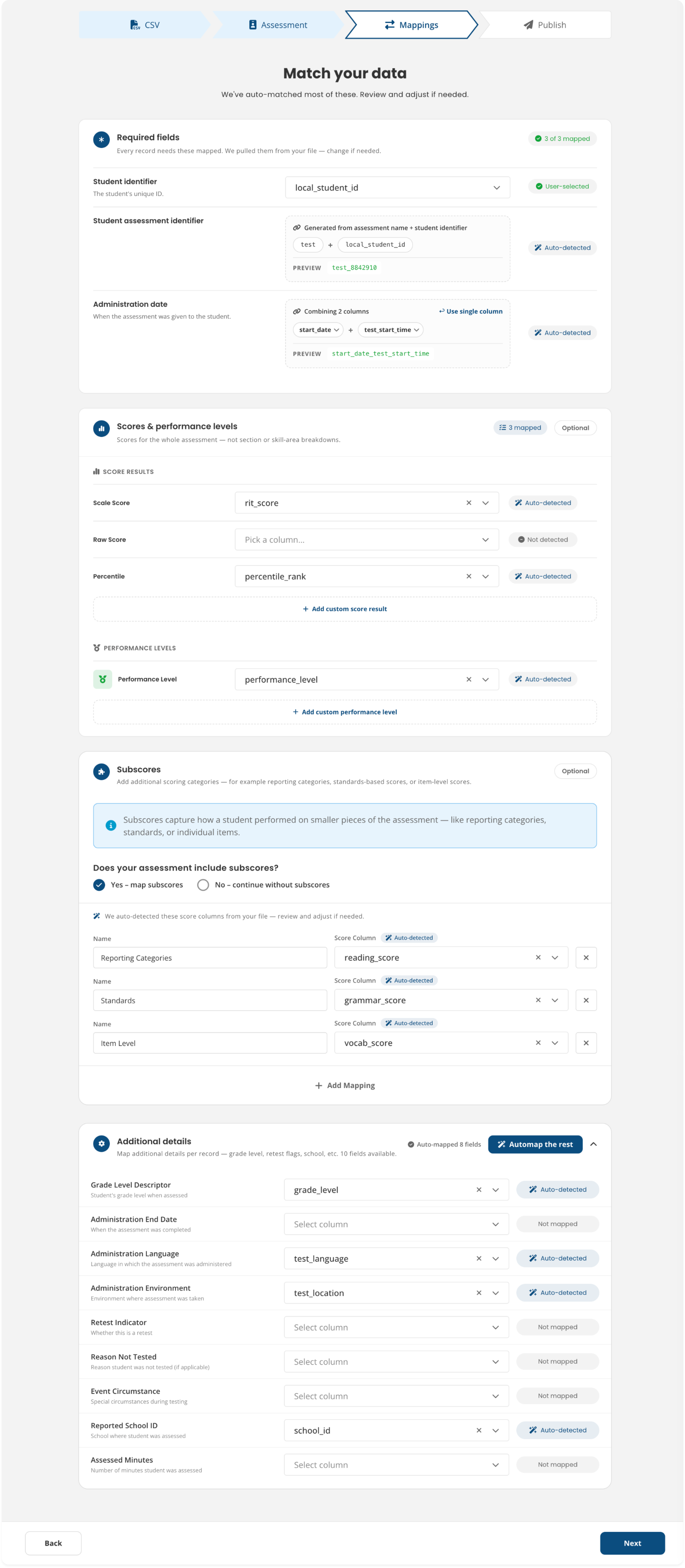
Mappings
Platform (Ed-Fi) fields on the left, user-provided file columns on the right. We used three states: Auto-detected, User-selected, Not mapped.
04/
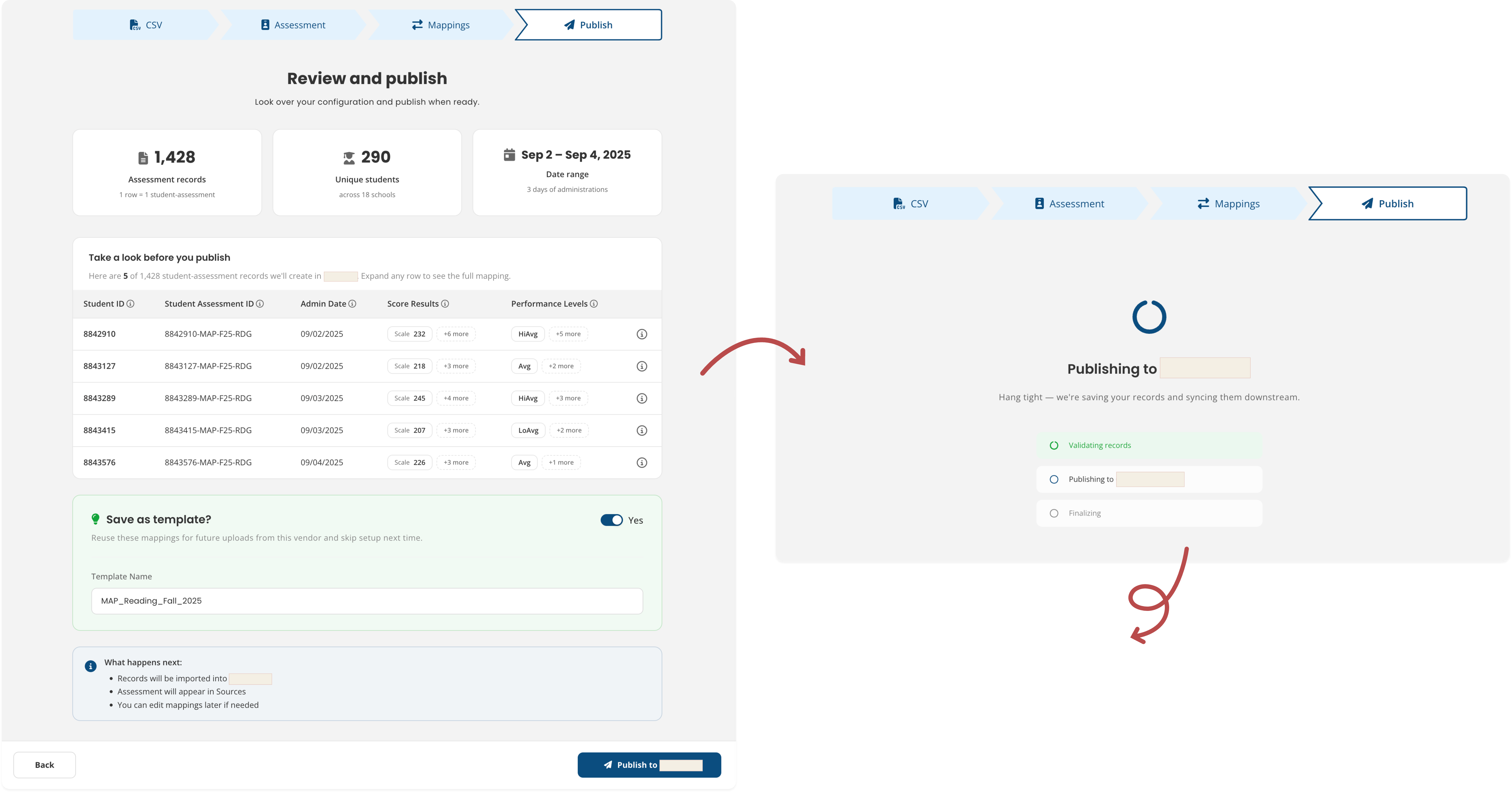
Review and Publish
Three summary stats: a five-row preview of real data and a “Save as template” toggle (on by default). This step helps users confirm the data looks correct before continuing.
05/
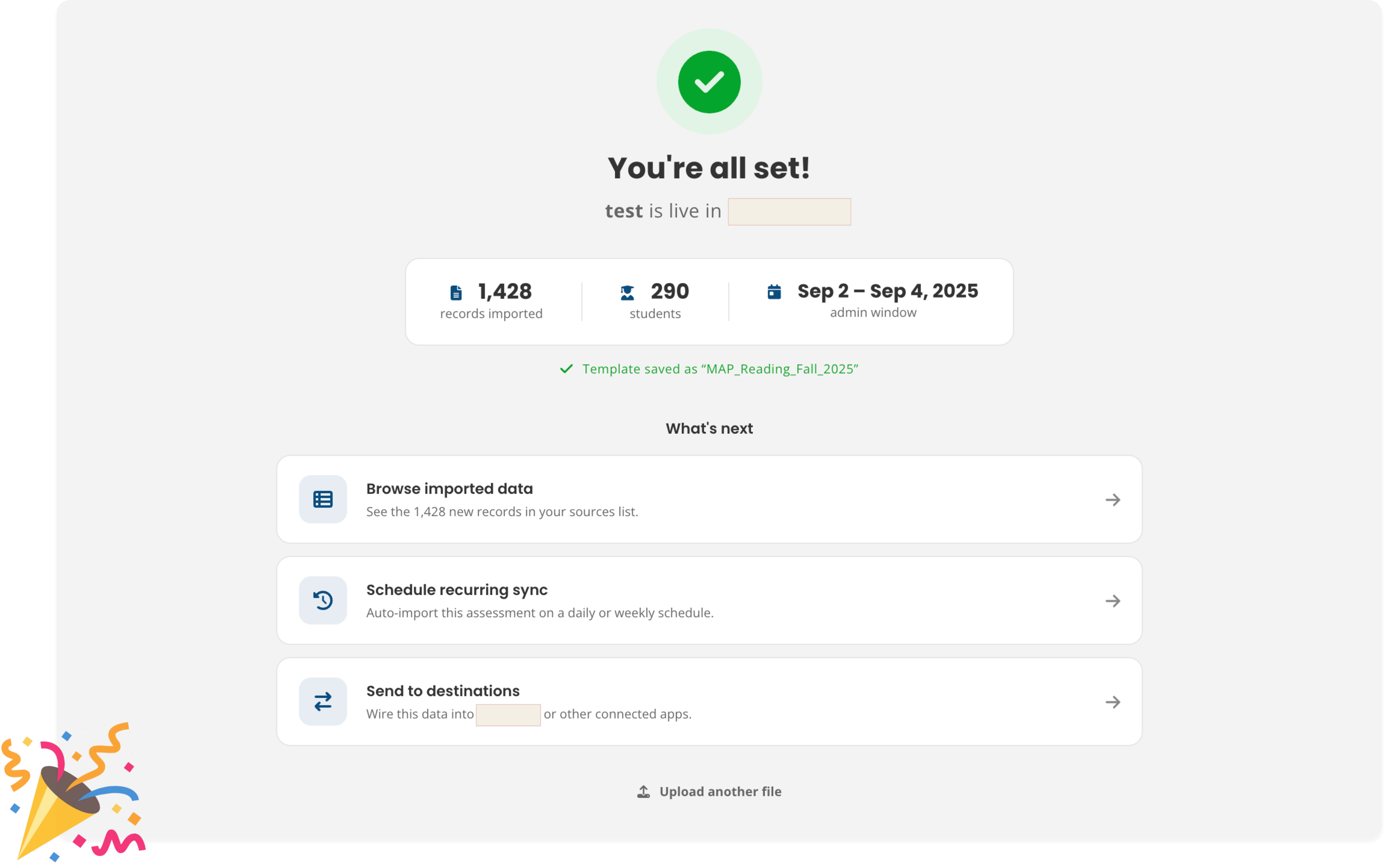
Confirmation
"You’re all set." From here, users can browse the data, schedule recurring syncs, or send it to a destination.
🗃️ THE SCREENS
1. UPLOAD
Clear expectations from the start.
The copy on this screen, "We'll automatically detect what's inside," sets expectations before anyone runs into any complexity. Once a file uploads, every column it found gets grouped right away into five general categories.
→ Before and after: “Perfect! We have your file” is a small but deliberate trust signal for the user.
💡DESIGN PRINCIPLE AT WORK
Make the transformation visible. Each step shows what the system found, what it did, and what still needs attention.
2. ASSESSMENT DETAILS
Filling in the gaps.
Auto-detected values show up clearly, each one labeled with the column it came from. Anything the system wasn't confident about gets marked "Needs your input," so it's easy to see exactly what still needs a second look.
→ Auto-detected vs Needs your input: Two badge states that tell users exactly where their attention is required.
💡DESIGN PRINCIPLE AT WORK
Automation should reduce work, not remove control. Auto-detected values are presented as suggestions, giving users the final say before anything is imported.
3. MAPPINGS
Mapping at your own pace.
Platform fields appear on the left, while file columns are on the right with a status label on every row. Users can review mappings one at a time, or use "Map the rest" to accept all auto-detected suggestions in a single click.
→ Users can move quickly with AI-generated suggestions or review every mapping manually. The workflow supports both approaches.
💡DESIGN PRINCIPLE AT WORK
Support different levels of confidence. Some users want to review every field, while others trust the system and want to keep moving.
The interface accommodates both without forcing everyone through the same process.
4. REVIEW & PUBLISH
Does everything match what I expected?
Users can review real rows from the uploaded file, see how the data will appear in the platform, and confirm everything looks right before publishing. The "Save as template" option is enabled by default and the next steps are spelled out clearly.
1,428 records. 290 students. Sep 2–4. If something looks off, this is the place to catch it.
💡DESIGN PRINCIPLE AT WORK
The review step shouldn't introduce new information.
It should give users confidence that everything they've already seen and configured is correct.
ON AI-ASSISTED PROTOTYPING
FULL PROCESS TRANSPARENCY
How Claude was used in this project.
Prototyping for this feature was AI-assisted through Claude. It was used to rapidly explore interaction patterns, test different approaches to the mapping complexity, and iterate during periods of unclear requirements.
The goal wasn't to generate solutions automatically but to think faster and evaluate more options than I could have alone.
I directed the exploration: evaluating, discarding, and refining what it produced.
That's a different skill from prompt-and-accept, and one I've been intentionally developing as AI becomes part of modern product design.
🎓 WHAT I LEARNED
The interface was never the hard part.
LESSON 01
The hardest problem wasn't the interface.
It was the mental model. Making the translation concept legible at every step was the actual design work.
LESSON 02
Auto-detection raises the stakes for transparency.
An auto-detected mapping that's wrong and invisible is worse than no auto-detection at all. Intelligent defaults only work if users can see and correct them.
LESSON 03
Ambiguous requirements are a design problem.
Getting unstuck meant treating the ambiguity itself as a design artifact. I started by mapping what was known, assumed, and undecided.
LESSON 04
Staying user-centered under pressure is a skill.
It required staying inside the product and engineering conversations. I had to be willing to push back when the design was being driven by technical constraints instead of user needs.
This project taught me that good design work often happens before anything reaches a screen. Sitting in on product and engineering conversations, mapping out what was actually known versus assumed, figuring out where to push back when constraints started driving decisions instead of user needs. That's where most of the thinking lived.
The interface mattered, but it was really just the last step in a much longer process of making something complicated feel a little more honest.