
🍪 BACKGROUND
A cookie business with no home online.
Sunshine Cookies creates intricately decorated sugar cookies for birthdays, showers, holidays, and just about every other reason someone might need a cookie shaped like a dinosaur, pumpkin, or wedding dress.
The business serves customers throughout Metro Detroit and had grown largely through word of mouth and social media. The challenge was that nearly everything happened through DMs, texts, and phone calls. There was no central place to browse past work, learn about the ordering process, or get a sense of the business before reaching out.
For new customers especially, that meant piecing together information from social posts and message threads.
The goal was to create a home base that could showcase the work, answer common questions, and make the ordering process feel more approachable.
📑 THE PROBLEM
The work needed to speak for itself.
People don't trust a cookie they can't see clearly. And when every order is custom (quantity, occasion, design, timeline) there's a lot to coordinate over text for both the customer and the baker. The website needed to do two things well: showcase the quality of the work and make the ordering process feel more structured.
Instead of piecing details together through a long DM thread, customers could see examples, understand the process, and submit the information needed to get an order moving.
Instead of piecing details together through a long DM thread, customers could see examples, understand the process, and submit the information needed to get an order moving.
📝 THE RESEARCH
Who doesn't love talking about desserts?
I conducted five interviews (ages 32–62), four over Zoom and one in person, with people who had either bought baked goods online before, or dropped off partway through the process.
Across all sessions, the same frustrations kept coming up: uncertainty around how long orders would take, unclear shipping costs until late in the process, and most consistently - a lack of confidence that the final product would match the photos.
That tension between structure and flexibility ended up shaping nearly every screen.
I want to see exactly what I'm getting before I pay for something this custom.
— Interview participant, age 38
I always wonder how long it'll actually take, and I never want to ask and seem pushy.
— Interview participant, age 45
WHAT PEOPLE WANTED
• Clear answers up front: timeline, price, what’s even possible
• Categories that don’t require scrolling through everything to find one thing
• A confirmation step that summarizes the order back
• Lots of photos
• Some way to show, not just tell, what they wanted
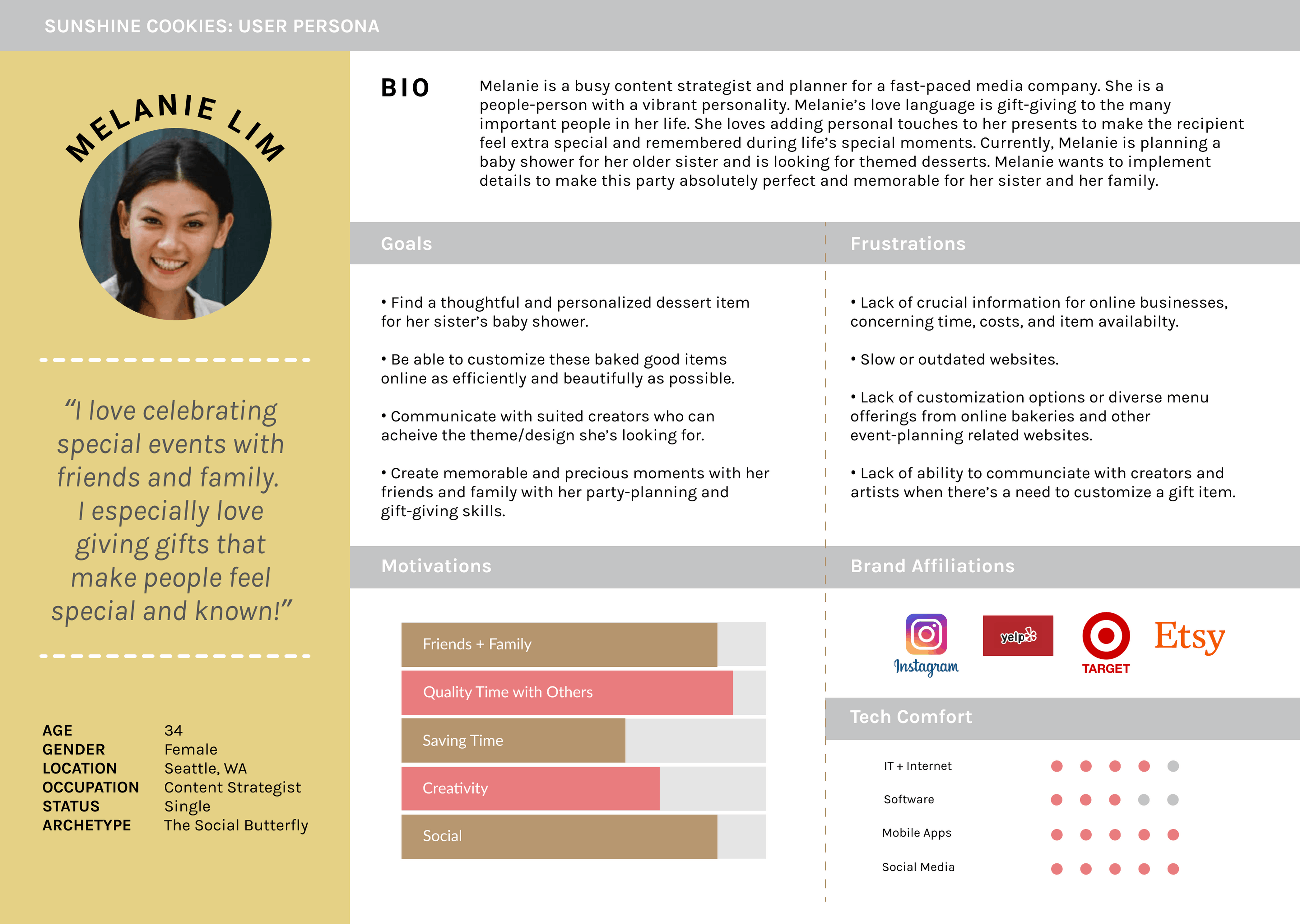
💁🏻♀️ MEET MELANIE
Custom cookie-ordering with certainty.
The typical Sunshine Cookies customer is someone planning something: a party, a shower, a milestone. Someone who wants the cookies to be a small “wow” moment, but hasn’t ordered custom baked goods online before and isn’t sure what’s reasonable.
She doesn’t want to feel like she’s bothering anyone with a strange request. She just wants the site to set expectations clearly, so she knows what’s normal before she ever has to ask.
She doesn’t want to feel like she’s bothering anyone with a strange request. She just wants the site to set expectations clearly, so she knows what’s normal before she ever has to ask.
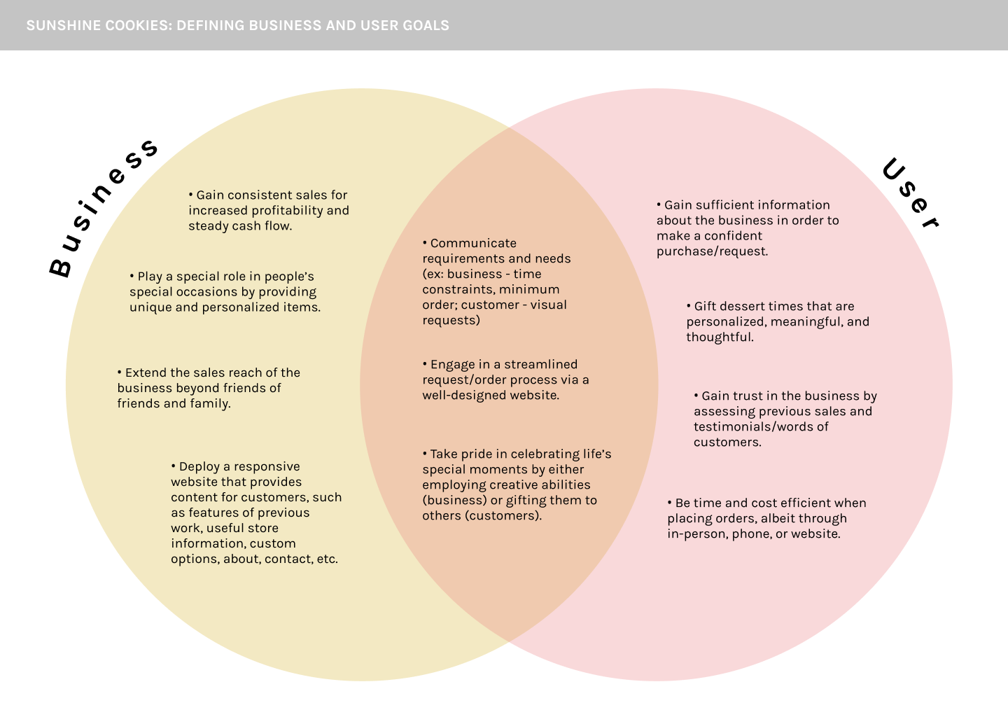
🎯 USER + BUSINESS GOALS
Mixing ingredients to bake a solution.
The customer wants clarity, confidence, and a simple way to describe what they’re looking for. The business wants a streamlined order form, strong social proof, and a gallery that does most of the convincing.
The overlap is where the design sits: a structured form that still feels easy, a gallery that builds trust while showing the work, and copy that answers questions before they come up.
The overlap is where the design sits: a structured form that still feels easy, a gallery that builds trust while showing the work, and copy that answers questions before they come up.
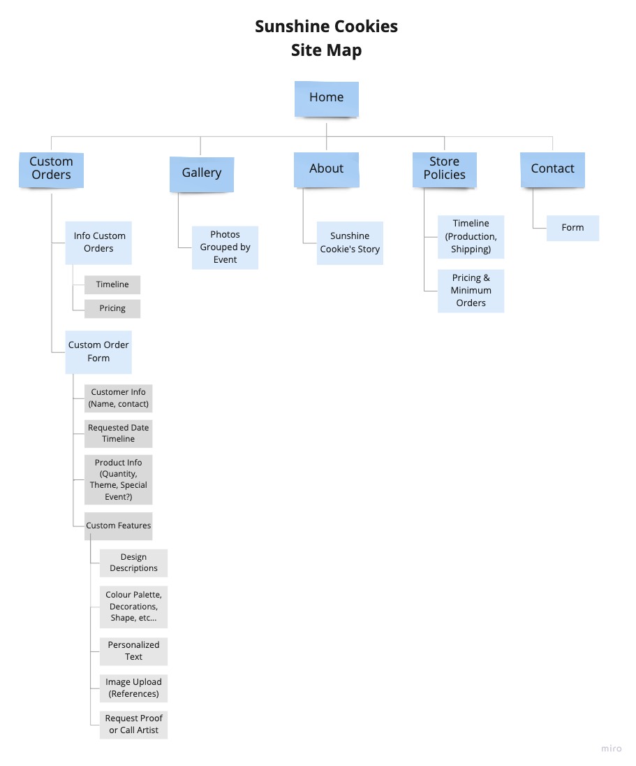
🗺️ MAPPING IT OUT
Keeping it simple and sweet.
Landing page, custom orders overview, photo gallery, and the order request form. I made it simple on purpose, because the goal was never more pages, but making clearer ones.
👩🏻🍳 TASTING THE
FIRST SAMPLE
FIRST SAMPLE
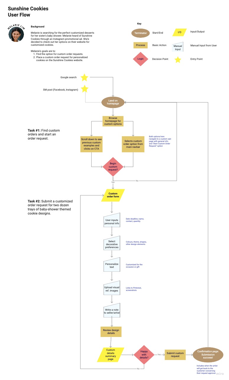
From sketches to wireframes.
After sketching the main flow in my notebook, I moved the ideas into a mid-fidelity prototype in Figma before any branding touched it.
The key screens included a landing page, a custom orders overview, a full order form, and a gallery. These mid-fi frames became the starting point for usability testing in the next stage.
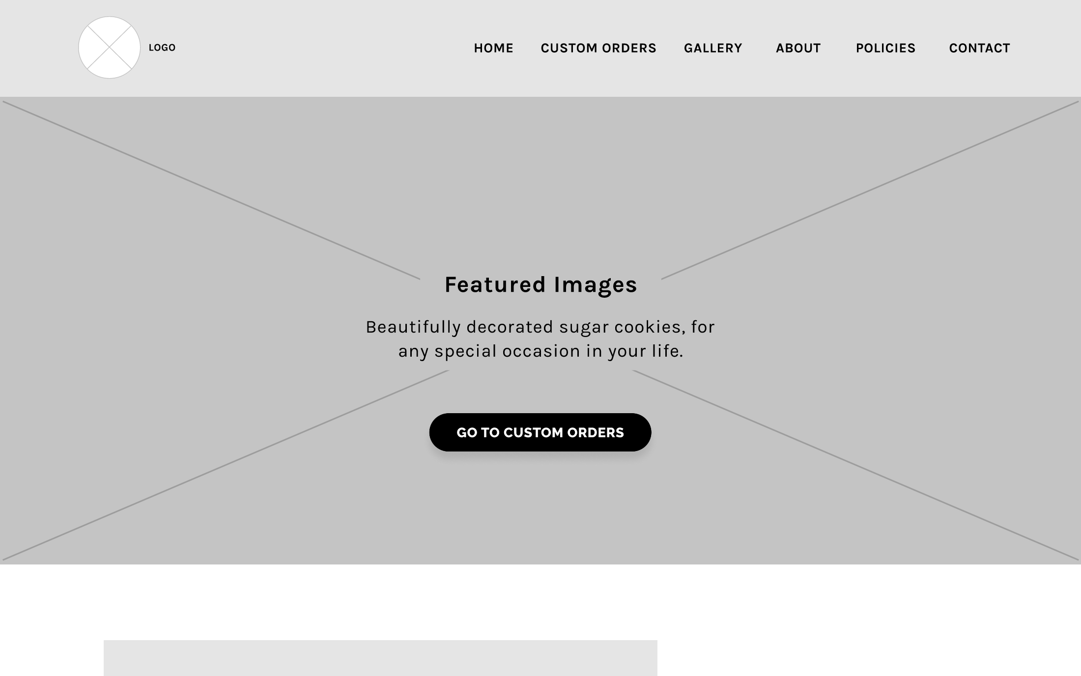
Landing page: CTA to start a custom order, testimonials, social links, and clear navigation.
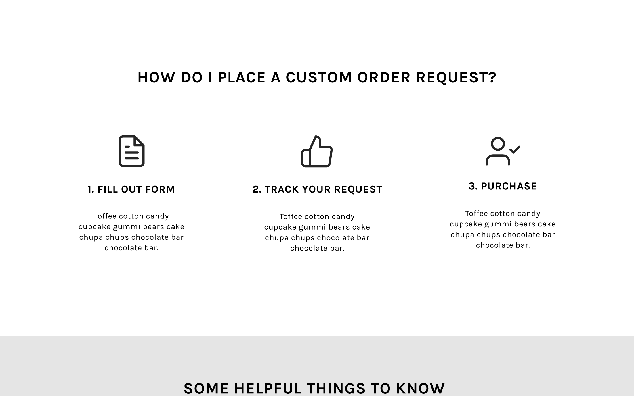
Custom orders overview: everything a customer needs to understand before committing to a form.
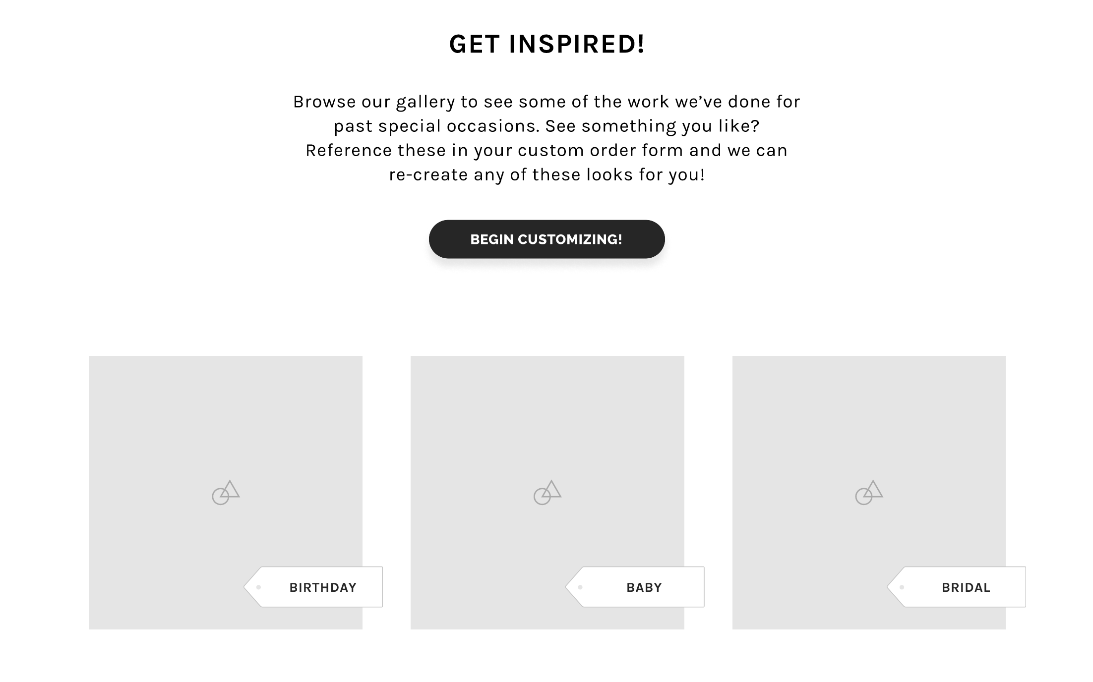
Photo gallery: a living portfolio that builds the trust DMs used to carry.
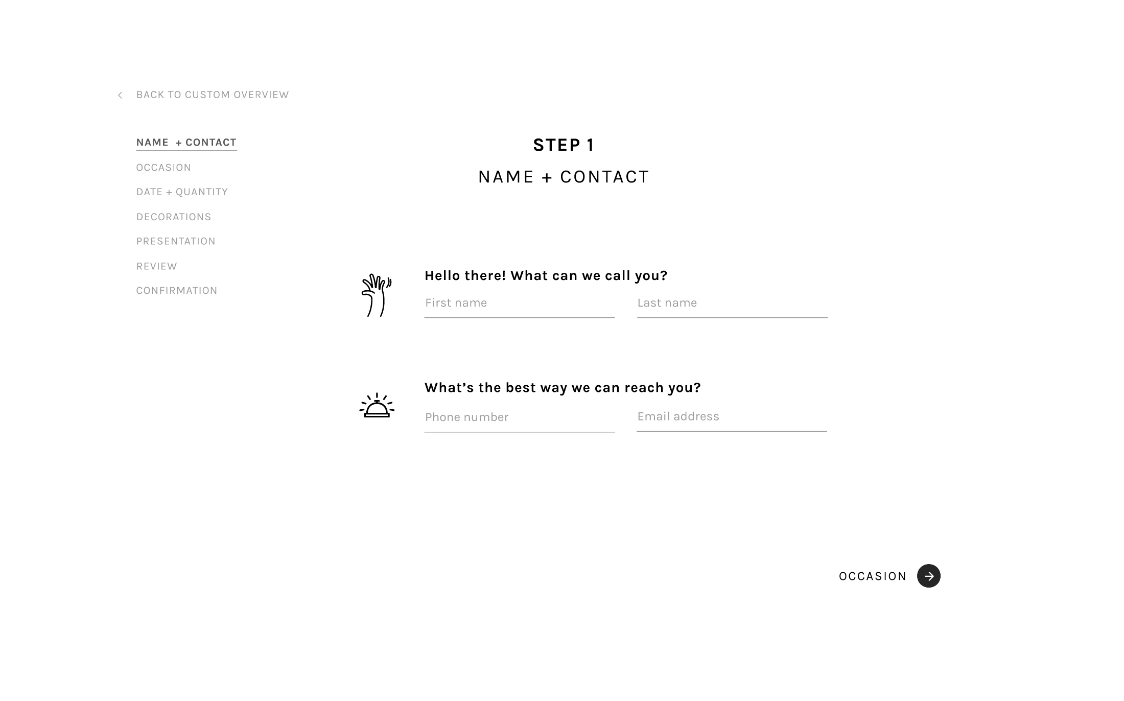
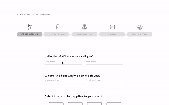
Order request form: personal details, design preferences, and a clean confirmation screen that sends the order back to the business.
The key screens included a landing page, a custom orders overview, a full order form, and a gallery. These mid-fi frames became the starting point for usability testing in the next stage.
Landing page: CTA to start a custom order, testimonials, social links, and clear navigation.
Custom orders overview: everything a customer needs to understand before committing to a form.
Photo gallery: a living portfolio that builds the trust DMs used to carry.
Order request form: personal details, design preferences, and a clean confirmation screen that sends the order back to the business.

🧪 USABILITY TESTING
7 out of 8 completed the flow without issue.
Eight participants completed four tasks: find the gallery, navigate to the custom orders page, review the information, and submit an order request.
Only one participant encountered an issue, and it had nothing to do with the flow itself. They missed an element that was clickable but didn’t look clickable. This was a small affordance gap that was easy to address.
Only one participant encountered an issue, and it had nothing to do with the flow itself. They missed an element that was clickable but didn’t look clickable. This was a small affordance gap that was easy to address.
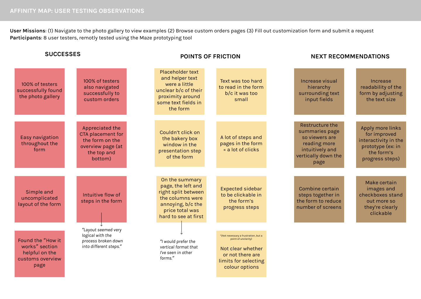
• Bigger, more readable type throughout the form
• Reorganized the summary screen so the recap was actually scannable
• Clearer copy around what’s customizable and what isn’t
• Fewer steps to get through the form
• A progress bar that actually felt like progress
• Reorganized the summary screen so the recap was actually scannable
• Clearer copy around what’s customizable and what isn’t
• Fewer steps to get through the form
• A progress bar that actually felt like progress
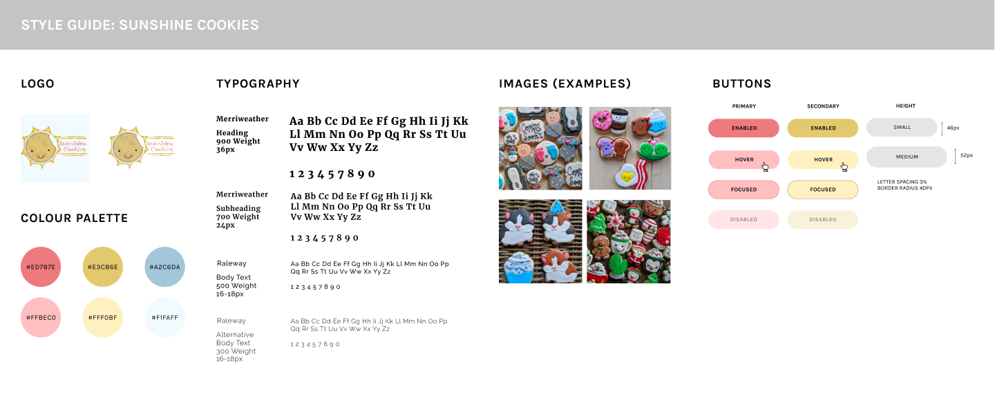
🎨 BRANDING + STYLE
Tasty, cheerful, imaginative, celebratory.
The existing logo and tagline provided a starting point for the visual system. From there, I built out the colors, typography, and UI components to reflect the personality of the business and the craftsmanship of the cookies.
👩🏻🍳 THE FINAL PROTOTYPE
Fresh out of the oven!
Landing Page
Overview Page
Photo Gallery
Custom Orders Form
Key takeaways for next time
LESSON 01
Clickable isn't the same as looking clickable.
The only usability issue wasn't a logic problem; it was a visual one. An element functioned correctly, but participants didn't immediately recognize it as interactive.
LESSON 02
Structure helps people move forward.
Customers didn't want fewer options. They wanted enough guidance to understand what was reasonable before making a decision.
LESSON 03
The gallery was doing more than showing photos.
The images weren't just decorative. They built trust, set expectations, and answered questions that would otherwise happen over text.
LESSON 04
Small businesses deserve thoughtful UX, too.
The scale was different from enterprise work, but the process wasn't. Research, testing, and iteration mattered just as much here as they would on a larger product.
The hard part was never the cookies... it was building something that didn’t undersell them.
Thank you for reading!
Thank you for reading!

